Creativity is often associated with clutter. There is this image of the artist that’s untamed, disorganized, a mess, but creative. This has long been the narrative of the creativity shown by the media and stereotyped by many. However, disorganization isn’t actually aiding your creativity.
No matter, if you are a boutique creative agency, a big-name firm, or a freelancer, – systemizing your media production process has nothing but benefits in store. However, with so many software systems to choose from, which one is right for your company?
Today, we’ll have a look at the differences and similarities between Krock.io and Wrike. We’ll also check if Krock is the right Wrike alternative for you. And we’ll do it from a creative agency point of view.
Digital Proofing

What is Wrike and How it Offers Online Proofing
Remote work is here to stay. And Wrike has great features that help in remote work proofing. Here are a few:
- Visual Comments – You can pinpoint where you want to leave a note on an image or video.
- Share in one place – Endless email threads with your team and customers are no longer the best option with Wrike. Share everything in what Wrike calls “comment silos” with your team.
- Communicate Clearly – You can easily tag a partner that you want to see your comment. Nothing gets lost or moved to junk mail with Wrike.
- Up-to-date – When you comment or change a file, it becomes the most recent one. No need to check and double-check that you and your colleagues are working on the same document, – it’s always the latest document that’s shown.
Online Proofing by Krock

One of the key features of Krock is its online media review system.
In a world of digital work, teams need an effective system to collaborate. And Krock’s online proofing system comes with numerous functionalities that help users have a better communication experience.
Let’s see the distinctive media review features Krock has to offer.
Media Review – All in One Place
Checking various notifications in various places can get tedious. Similar to Wrike, with Krock, your team can review all the assets in one place. And with Slack integration, you can get all the notifications from Krock directly into your Slack channel. This way there is no chance you’ll miss any note or comment.
Timestamps for Video Review
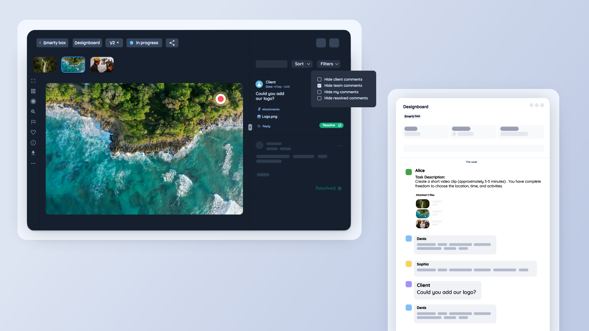
All the comments are time-coded. And each time you leave a note on a video file, a timestamp will automatically accompany it, marking your comment.
Shoutouts
Forget group chats, where your message gets lost in the noise. With Krock, you can tag a certain coworker in the comment and they will be promptly notified by email.
Taking a look at the feedback functionality in Krock, you can leave comments not only on images or videos but also on the pdf and interactive storyboards. This comes in handy when you are discussing a script, a client brief, or a storyboard for your project.
Krock also has a better filter system, allowing you to filter and sort your comments section by time, author, or a specific file. And there, Krock offers a great Wrike alternative in terms of online proofing.
Client Review System
Krock’s one-click client review request is a real gem! It’s simple, intuitive, and your clients won’t have any trouble with using it right away.
You can send a current version of your file for a client review directly from the dashboard. Your client will get an instant email with a review request and a link to the current version of your work. Once they are in Krock.io they simply have to hit the “Approve” or “Reject” button, and optionally leave a note for you.
You can now forget the endless email threads with heavy attachments and many, many links to your Google Drive.
Creative Agency Project Management
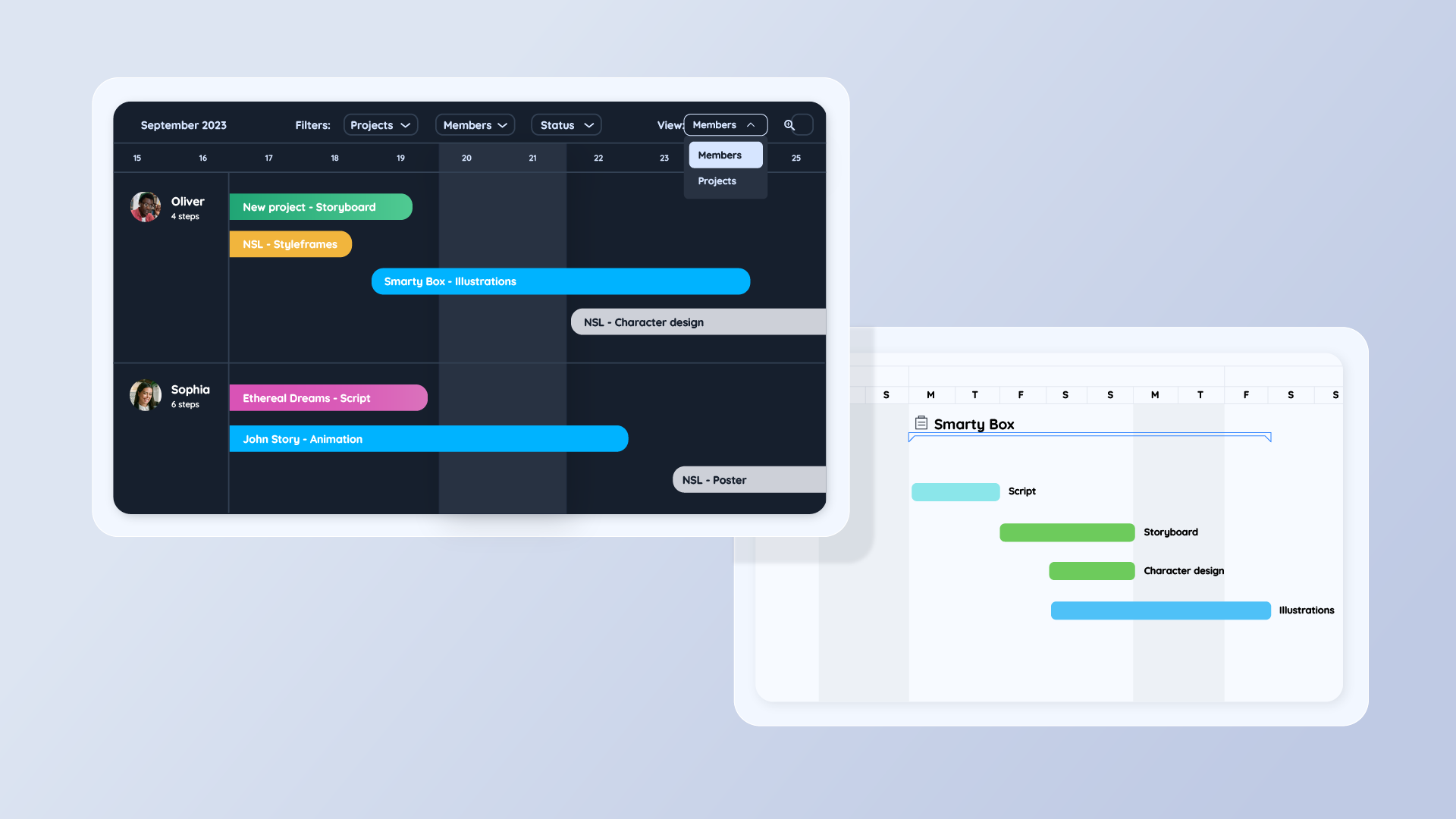
Both tools share a similar set of project management features. Interactive Gantt charts; time tracking and reports for task accomplishment for teammates and freelancers; workload visualization with calendars; and ready-made templates to start working on your project swiftly. Let’s take a look at how they differ.
Managing Creative Projects in Wrike
Managing creative projects can be stressful enough. Doing it remotely – even more so. Wrike comes with many features that ease this struggle, such as:
Pin Projects
You can pin projects to three different categories: to do, in progress, and completed, making it easy for your team to see what’s due.
Wrike Gantt Charts
Just like Krock, Wrike uses interactive Gantt charts to organize what projects are currently on the roster, who is on the team to complete them, and what’s coming up. This way you can create a steady, organized workflow.
Mark Progress
Wrike has many options users can select to notify the team of project progress. Whether you’ve just started, fallen behind, or haven’t started at all, you can make this clear to your colleagues and keep information transparent.
Folders
You can categorize your projects into folders according to the client or a team.
Creative Project Management in Krock
Krock has all the features Wrike has, plus some:
Various Workspaces
Not everyone in your agency has to know about all project updates. Keep separate workspaces dedicated just to those working on that specific project.
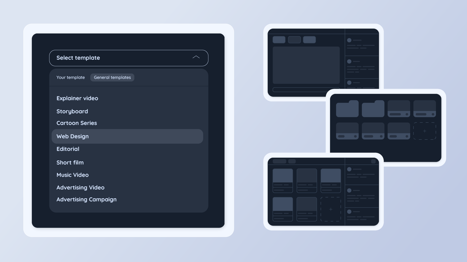
Ready-Made Templates Specific for Creative Field
Project templates in Krock vary from cartoon series to advertising campaigns. Krock was built by creatives for creatives. And the custom templates, dedicated to organizing each step of your unique projects, have every detail of every specific media project in mind.
Assign Tasks in Comments
There’s no need to exit a chat just to send a task to the person you were talking with. Assign tasks directly in the comment section by mentioning your teammates. They’ll get an immediate notification by email.
Storyboard Software
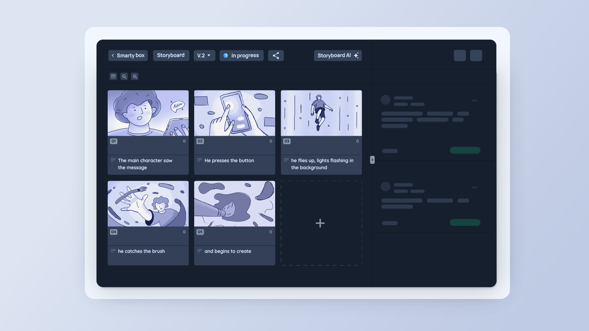
The standout feature for Krock that Wrike lacks is the storyboard software since Krock was made with video production teams in mind.
The storyboard builder offers easy upload of the images, with the order of the images transferred to the order of the frames. Then, you can drag the frames to change the order without worrying about the numeration – it will sync automatically. You can also customize your board frames. Share the storyboard with coworkers and clients online, leave notes and frame-specific comments, and finally, easily download the file as a PDF to share off of Krock.
Pricing
Wrike Pricing
Wrike has many pricing plans for users’ needs. However, Wrike offers only monthly plans. There is a free plan, that comes with a limited amount of features. A free plan would probably be enough for a starting freelancer, but an agency team would need more functionality. An adequate plan for various creative project management would be a Business subscription, which goes for $24.80 per user per month.
Krock
Krock’s offers flat pricing. Which differs from Wrike’s per-user fee plans. You can choose a monthly subscription or an annual plan and save 20%. For comparison purposes, we will go through Krock’s monthly plans. Krock also gives far more storage with each of the packages compared to Wrike.
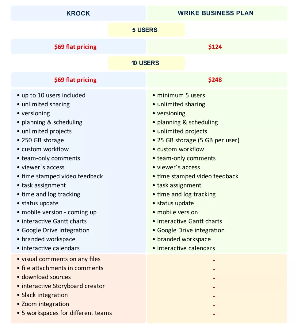
As we are comparing the two tools from an agency perspective, let’s take a look at the monthly cost of each one. If you are a team of 5 and opt for the Wrike Business plan, you are looking at the monthly cost of $124, as opposed to Krock’s $99 for unlimited users so that you can grow your team without growing your software cost.
Not to mention, that if you are in video production, you’d still need to pay for additional software for storyboarding.
Check out this features and price comparison table for a quick recap:
What Software Fits Your Team Best?
Both tools definitely have competitive advantages, when it comes to project management and online proofing. Krock, however, was designed specifically for creative industries. It is traceable in every aspect of the software: from the user-friendly interface to specific to various creative industries project templates.
Wrike, on the other hand, requires a little more time and effort for onboarding both teams and clients.
Both tools have a trial period. You can always try Krock for free or book a quick demo call and check out all features the platform has to offer.
Having compared both platforms, we hope this article will help you choose the right fit for your team.
FAQs
1. What is the best Wrike alternative?
There are a variety of alternatives to Wrike available nowadays. If you are searching for the best alternative to Wrike for creative agency project management, Krock is definitely an app to look into. Krock offers a user-friendly interface, ready-made project templates, specific to various creative industries, team and client review features, etc.
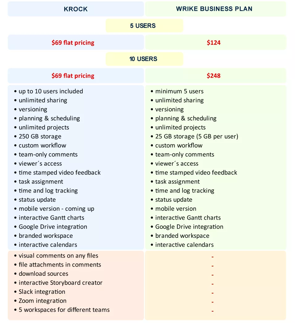
2. What is Wrike pricing? How does it compare to Krock pricing?
Check out the feature and pricing comparison chart:
3. Does Wrike offer a Gantt chart?
Yes, Wrike offers an interactive Gantt chart feature, the same as Krock.
Check out how to use Gantt charts for creative project management.
4. How do Wrike review features compare to Krock media review features?
WRIKE | KROCK |
| Visual Mark-Up Comments | Visual Mark-Up Comments |
| Share all files in one place | Share all files in one place |
| Comment Mentions | Comment Mentions |
| Email Notifications | Email Notifications |
| Time-Stamped Video Feedback | Time-Stamped Video Feedback |
| Versioning | Versioning |
| Team-only Comments | Team-only Comments |
| – | Visual Comments on Any Files |
| – | File Attachments in the Comments |
5. How task management in Wrike compares to task assignment in Krock?
WRIKE | KROCK |
| Unlimited sharing | Unlimited sharing |
| Task assignment | Task assignment |
| Task scheduling | Task scheduling |
| Interactive Gantt chart | Interactive Gantt chart |
| Unlimited projects | Unlimited projects |
| Custom workflow | Custom workflow |
| Status update | Status update |
| Google Drive integration | Google Drive integration |
| Branded workspaces | Branded workspaces |
| Interactive calendar | Interactive calendar |
| 25 GB storage | 250 GB storage |
| 5 users minimum | Up to 10 users – no minimum |
| – | Download sources |
| – | Interactive storyboard creator |
| – | Slack integration |
| – | Limitless workspaces |
